Harmonious Color
- Marissa Villescas

- May 22, 2023
- 2 min read

As a self-taught artist, teacher, and mother, I often doubt my ability to paint professionally. Even though I have been working on my craft for years and have most of the necessary tools, I struggle with color theory and selecting the right palette for each piece. This self-doubt can be overwhelming, and it's something that I've been working to overcome.
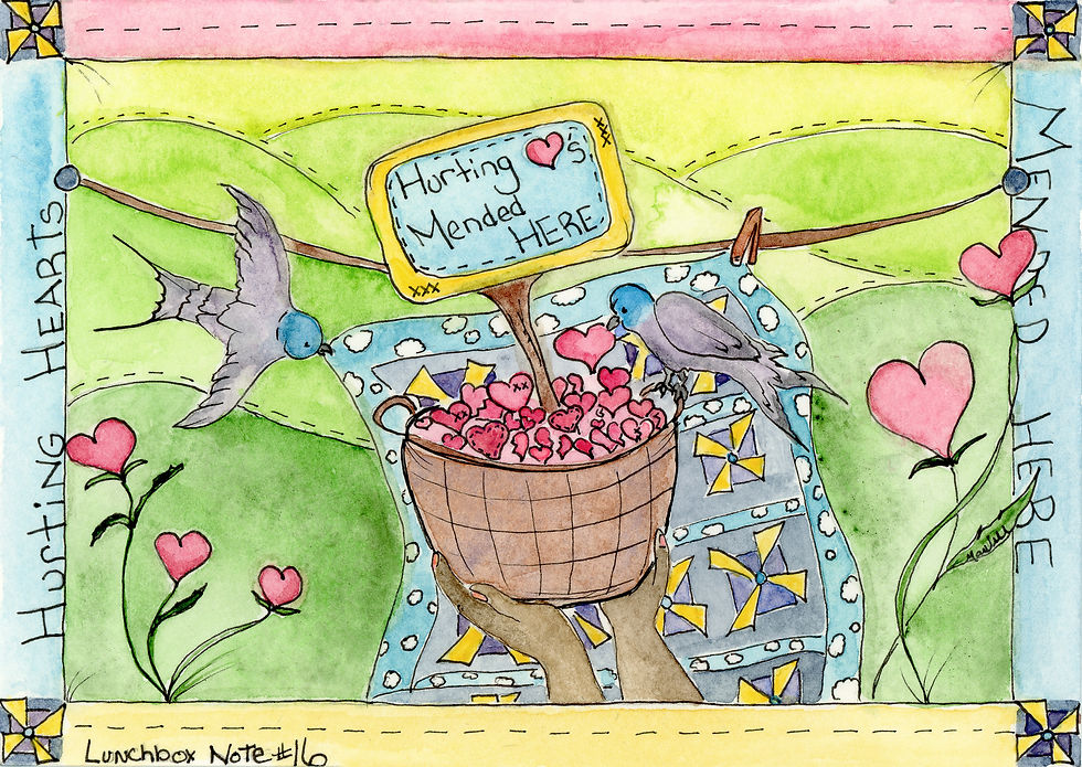
This year, I decided to embark on a color journey to explore which watercolors I gravitate toward and which ones don't work for me. I've always been drawn to the full spectrum of colors and tend to use multiple hues in my art, wardrobe, and home decor. However, I've come to realize that pairing specific colors can create a more cohesive and harmonious look.
When I first started using watercolors seriously, I could only afford one or two colors at a time, so I would choose my favorites. I had a basic knowledge of the color wheel, but when faced with so many beautiful hues, my heart and childlike unicorn spirit came out. Sparkles and ocean blues, sunny yellows and bright pinks came home with me and into my watercolor box, (yellow ochre and brown didn’t stand a chance). As a result, my palette lacked harmony, and some colors didn't exactly complement each other.
Now nearly six years after buying my first professional paints, I am overhauling my colors. I’m evaluating tones, and color harmony, and picking the ones that I use more and best represent me. After a large selection of over 100 colors, i have cut that down to half. Harmonizing the rainbow of favorites and complimenting one or two together. Like Peanut Butter and Jelly, or Peanut Butter and Apples, Peanut Butter and Chocolate, or Peanut Butter and Bananas, you see my theme here. Overall it has made me feel more like a professional artist, and has given me the confidence to show my whimsical, colorful work more. Yellow Ochre and Brown are now an essential part of my day.


Comments